The redesign of the brand for the meetups was one of my first projects at Qonto. One of the problems was that the Creative Direction has been created too quickly and it was just following a trend at the time. The consequences were that the prospects didn't trust the brand on keeping up with the current news.
Client
Qonto
Category
Brand Identity
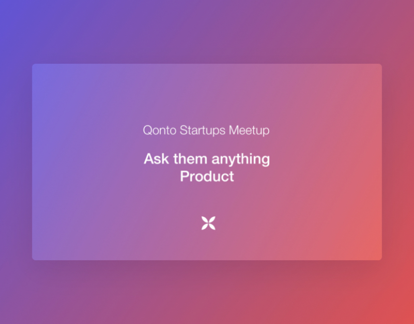
An overview of the previous layout of the events' visuals
When I started working on this project, I wanted to really understand the need and what was missing in the previous layout. So I began by asking the people in charge of communicating on this event what information they needed to display and which format they needed.
I then decided to ask some of the prospects what they thought about the layout, and ask them a simple question to know which info they needed: "If I gave you this, how would you attend the event?"
We decided to go for an eye-catchy Creative Direction, made of playful and geometric shapes that will be animated on the different types of media.
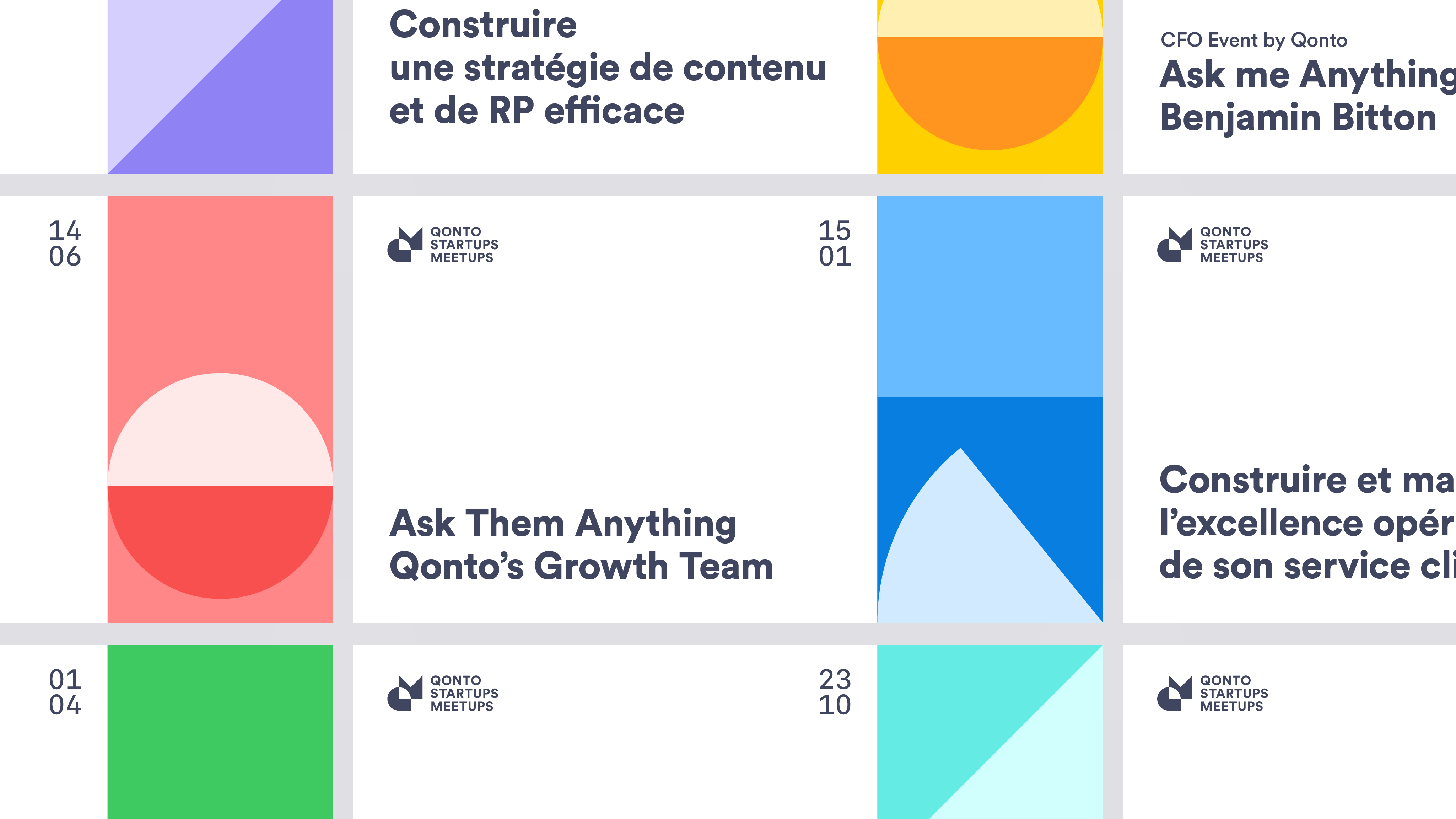
We decided to go for a system to create the visuals as efficiently as possible.
An example of the first variations in the animated side panel of the visuals
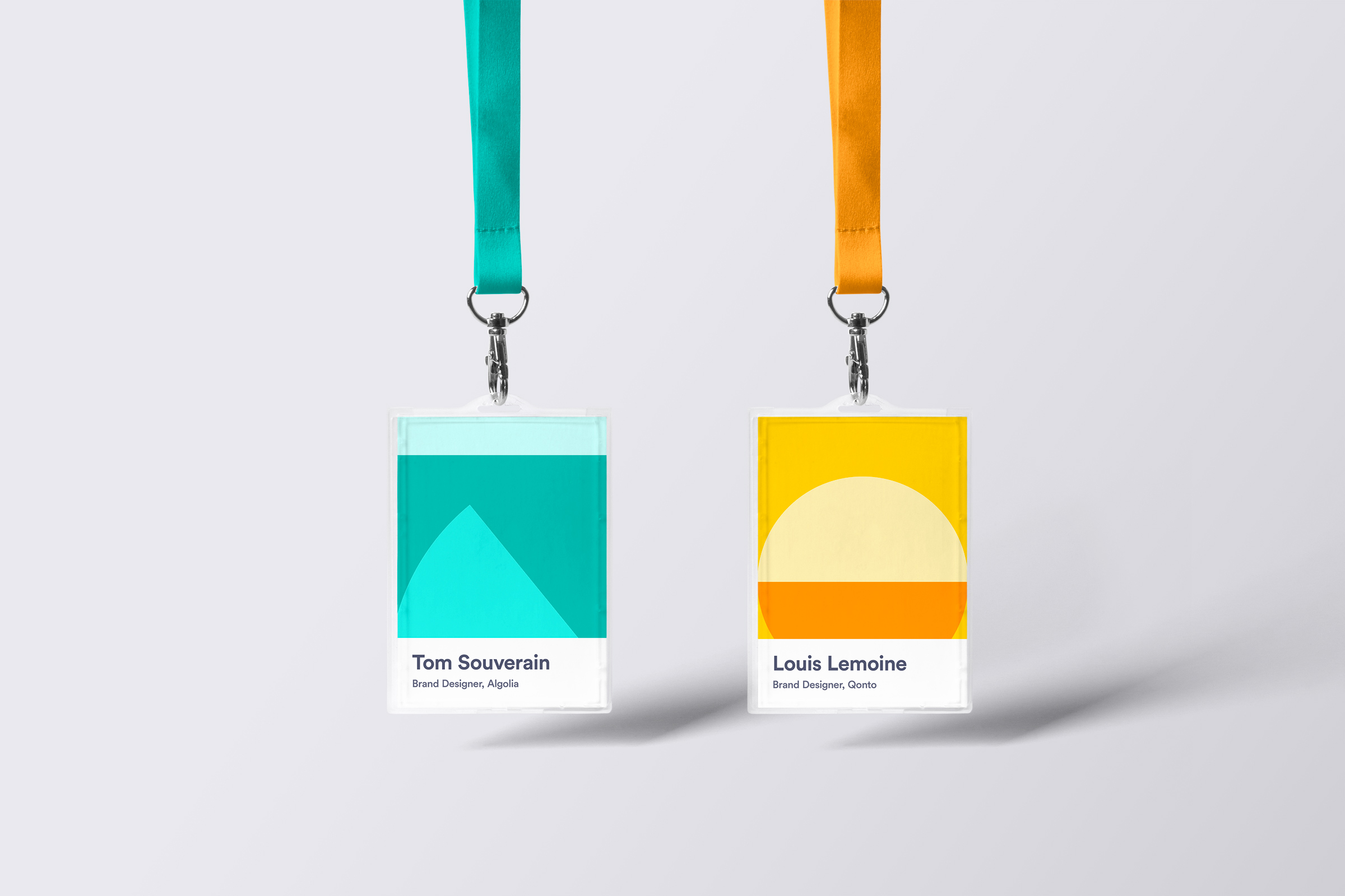
The badges for the participants of bigger events.
Contact.
Email: hi@louislemoine.me
Dribbble: @louislemoine
© Louis Lemoine 2023
Brand & Product Designer