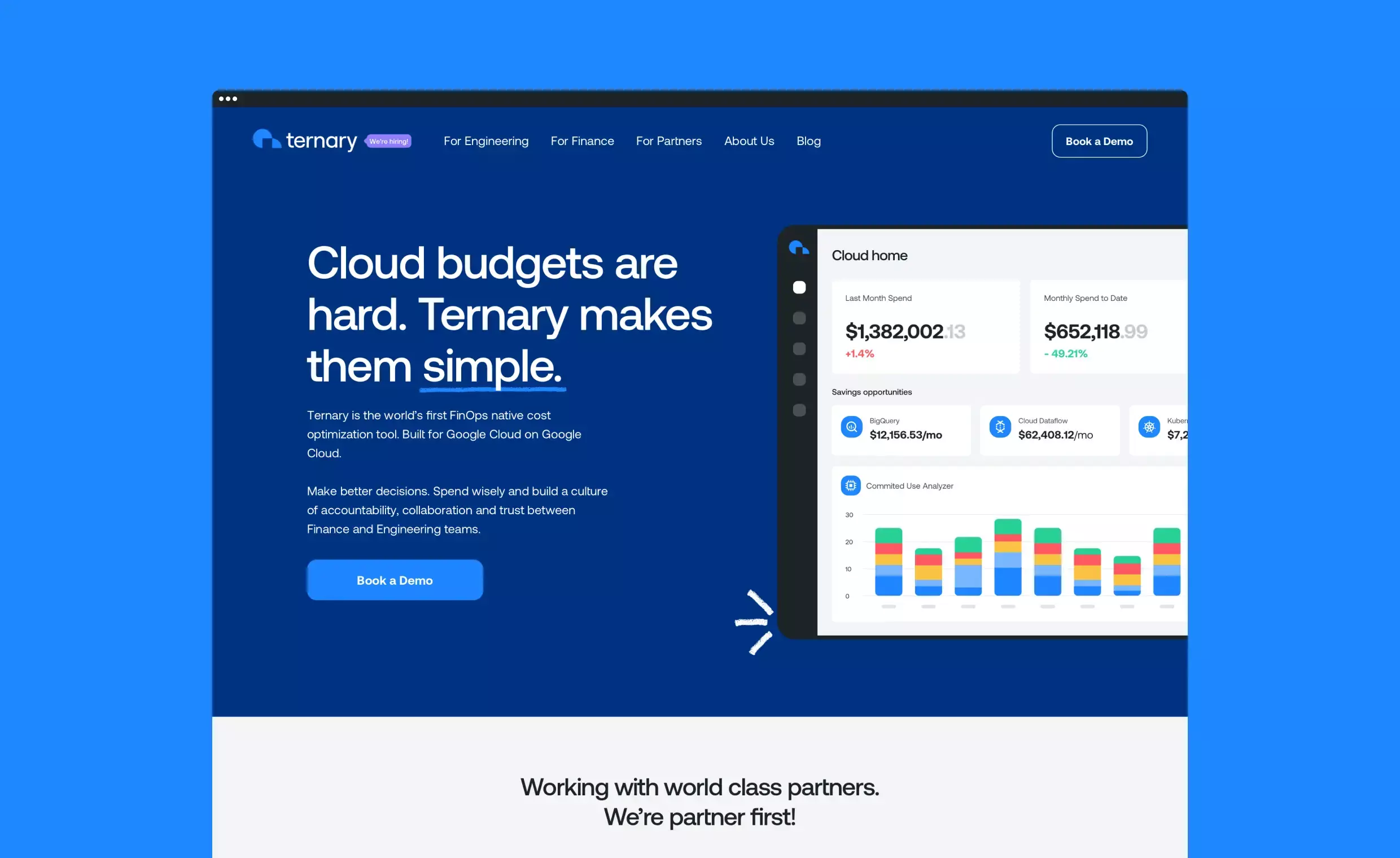
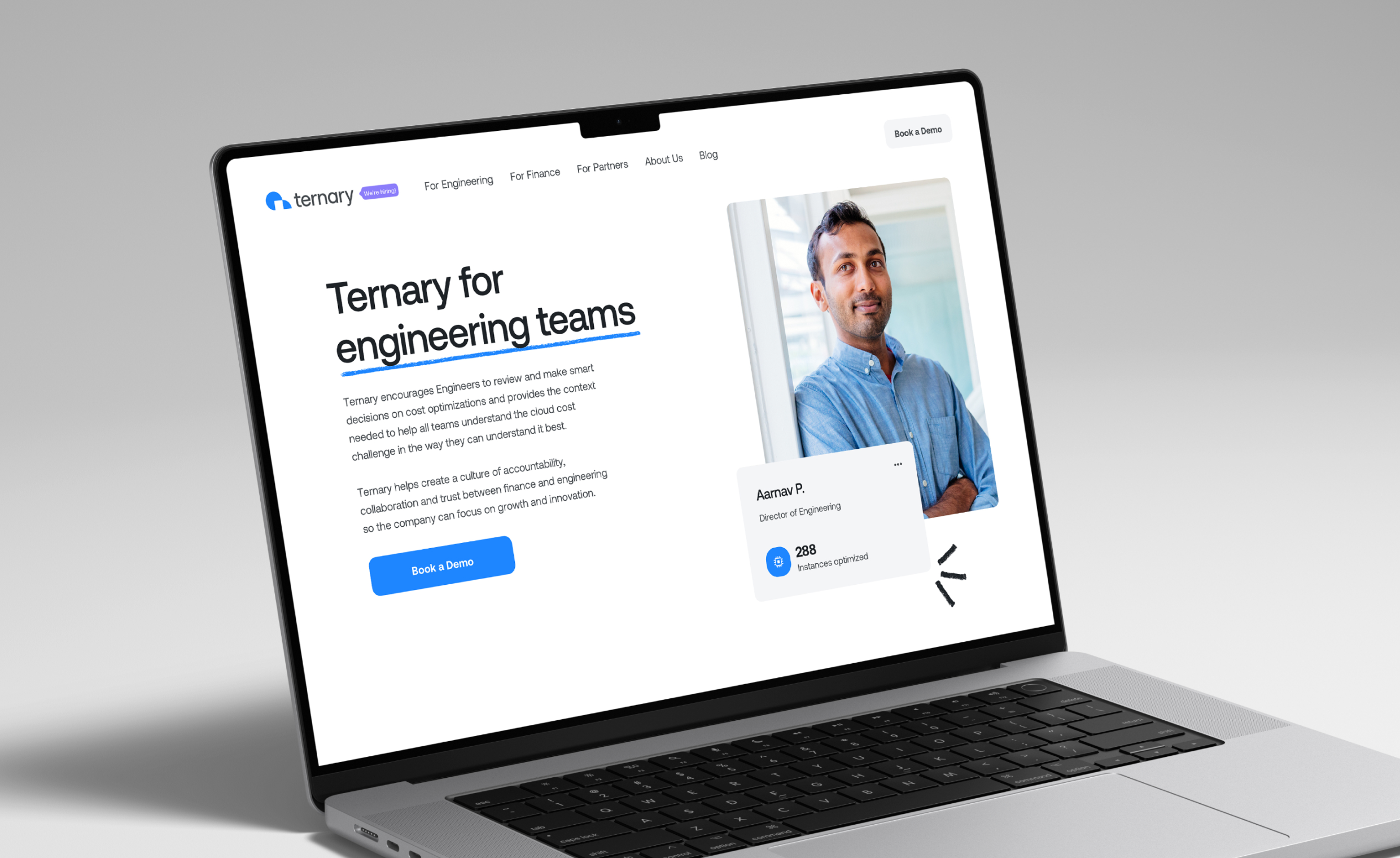
Ternary is the world’s first native FinOps cloud cost optimization tool built for Google Cloud on Google Cloud. Ternary solves the cloud budget challenge by bridging the gap between engineering and finance teams.
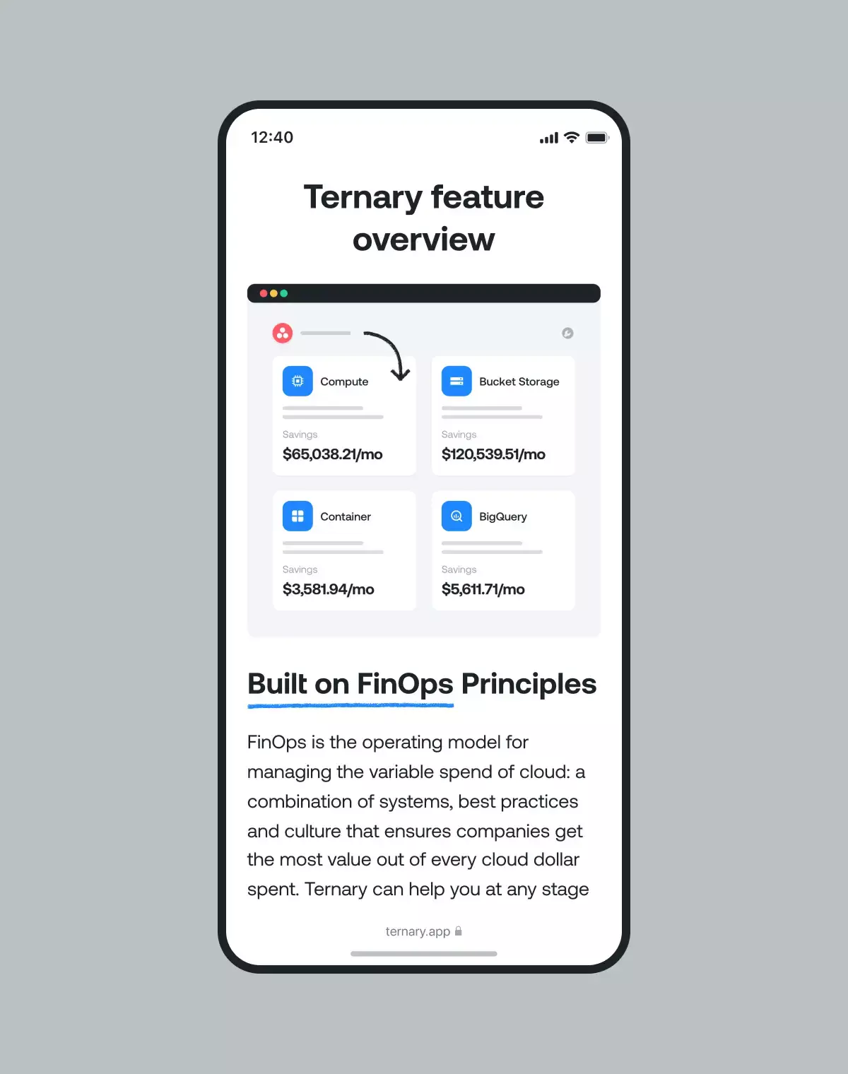
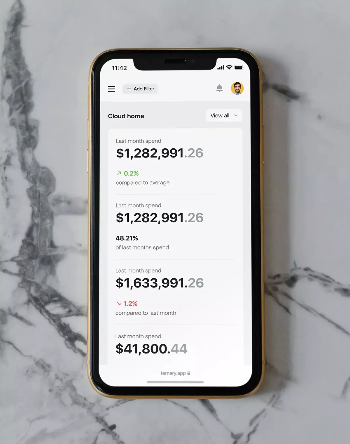
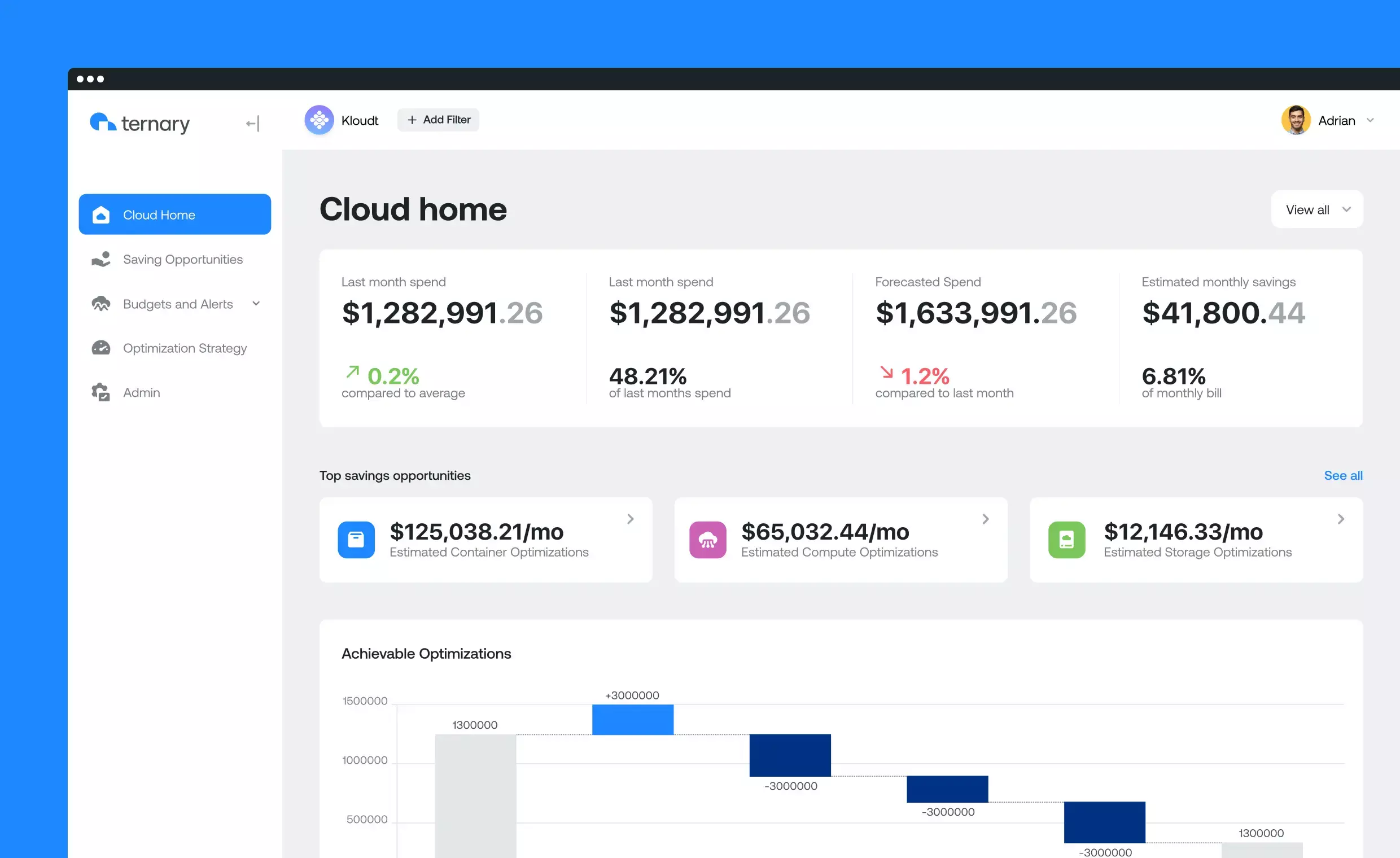
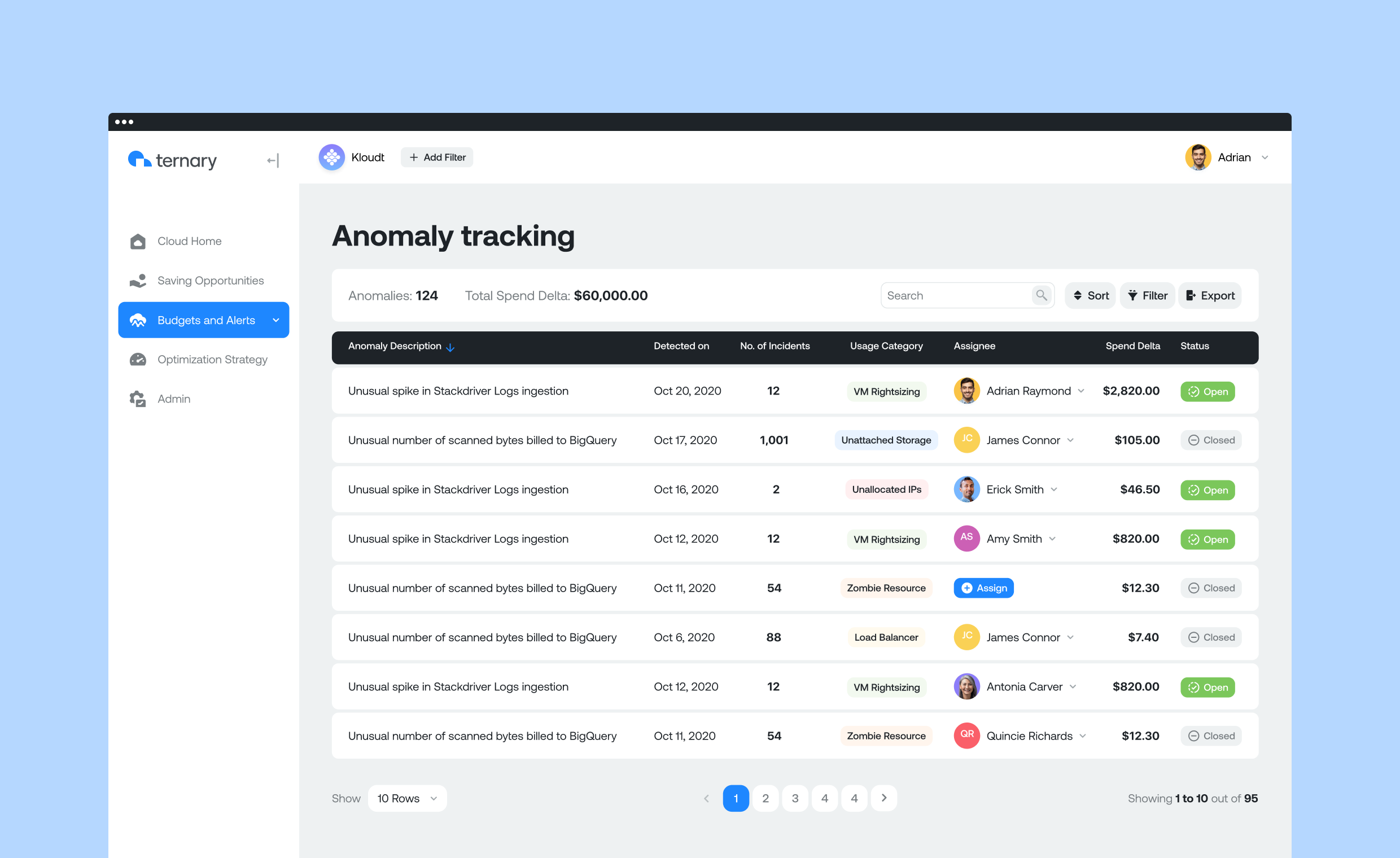
Through its SaaS platform, Ternary helps customers visualize their cloud spend across all clouds, provides spend analysis, and offers spend optimization opportunities. These recommendations can then be implemented through spend allocation and workflow collaboration.
The issue
The companies and their competitors rarely address the visual perspective of their products, often neglecting functionality and user experience.
That’s why the folks at Ternary asked us to develop their visual identity and a website and optimize their product from the user’s perspective.
The solution
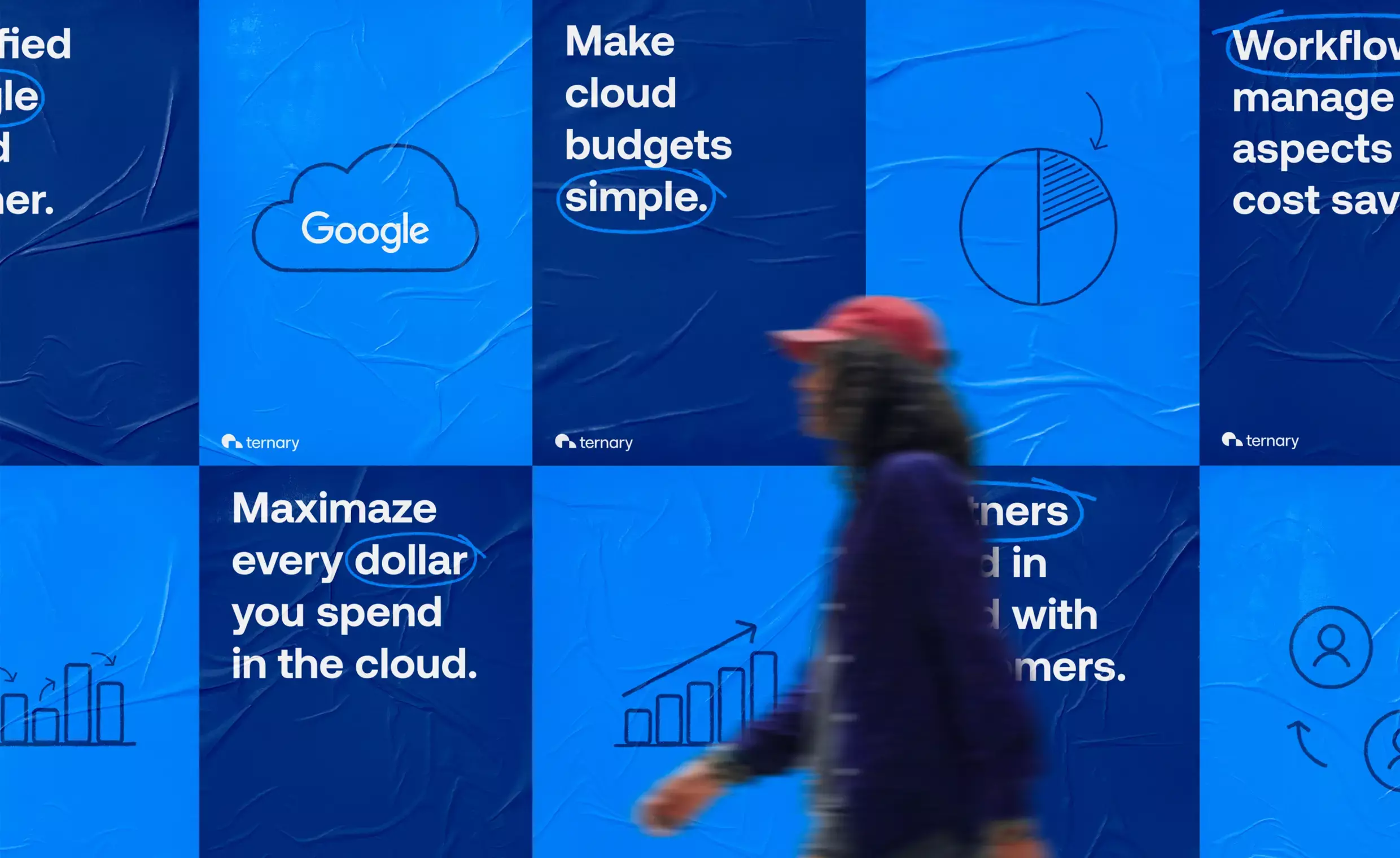
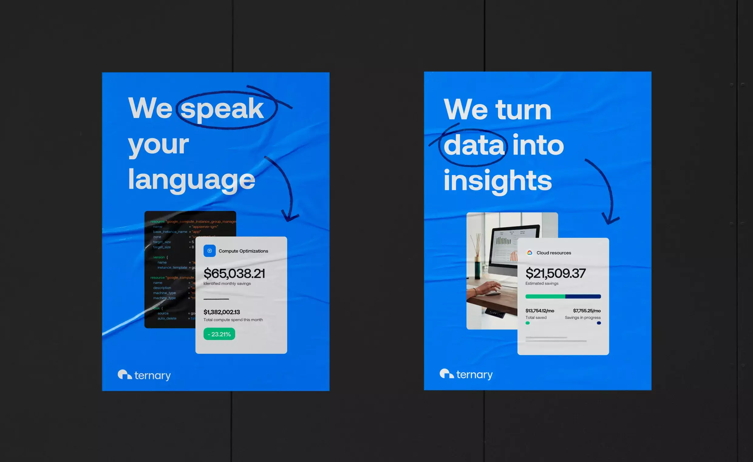
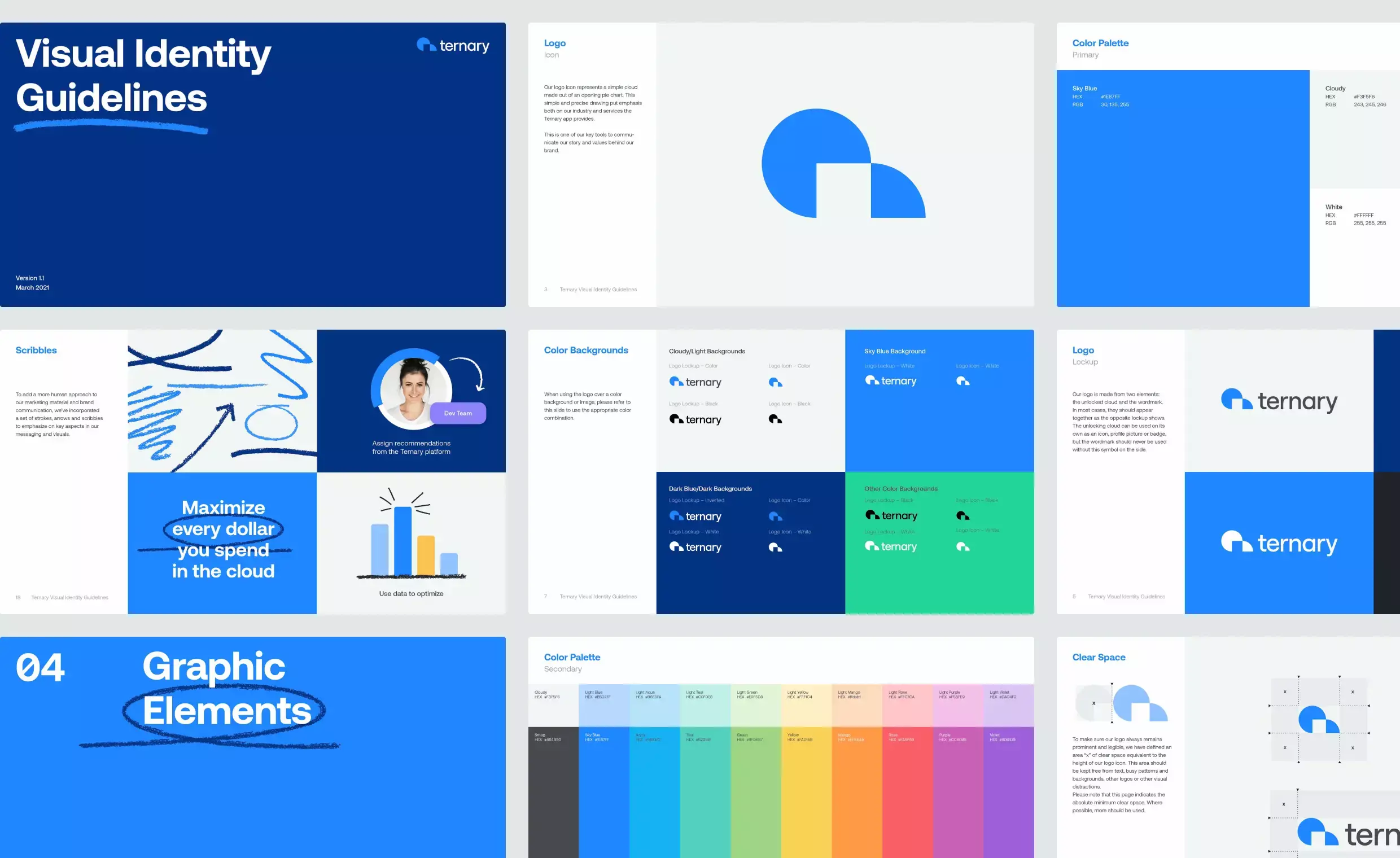
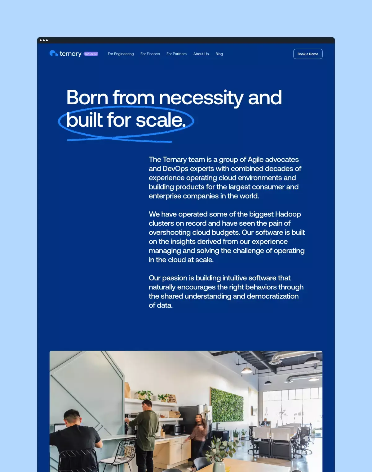
We rebranded Ternary with a new visual identity that distinguishes them as the new “cool kids” who’re here to change and challenge the industry.
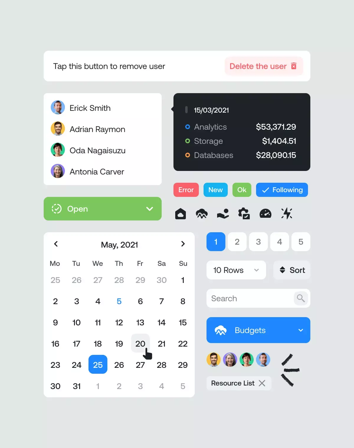
To achieve this, we redefined and optimized the main user flows in the product environment to improve the overall user experience. The introduction of a new design language and system offered a fresh perspective in a visually stale and rigid industry.
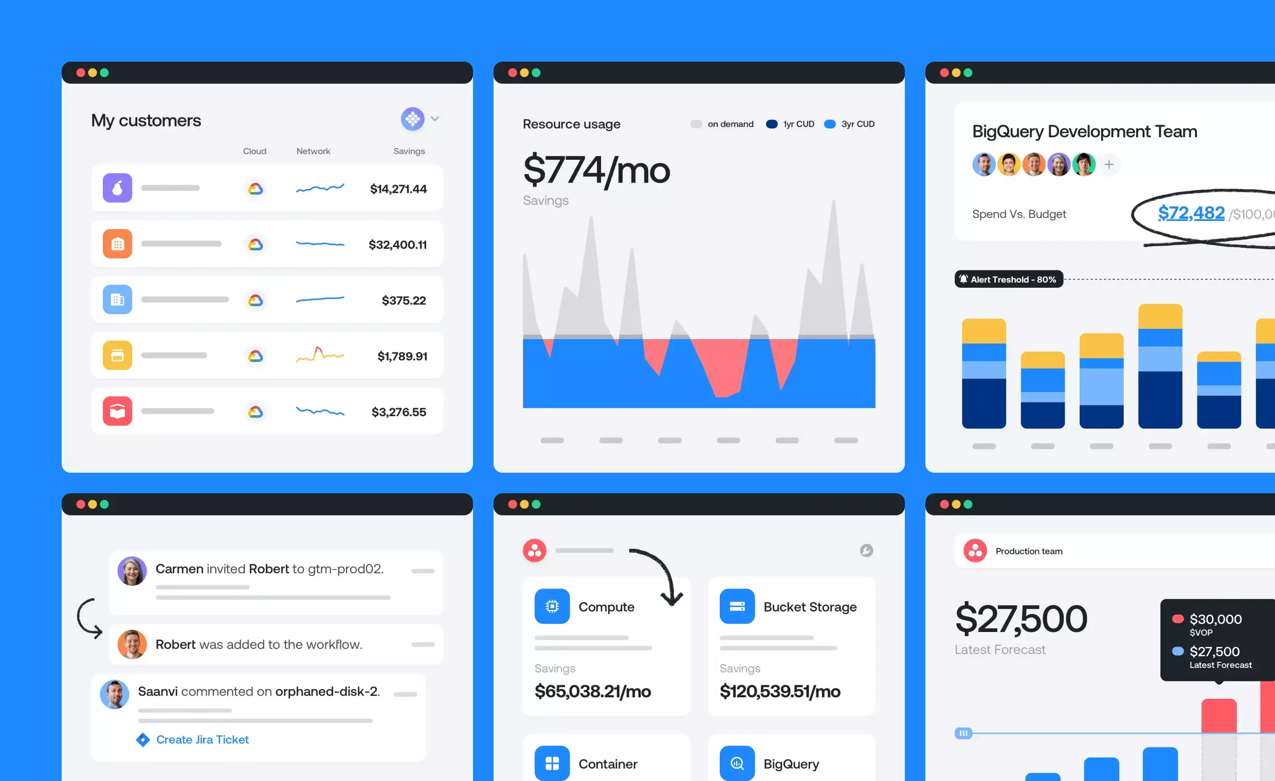
Emphasize on the data
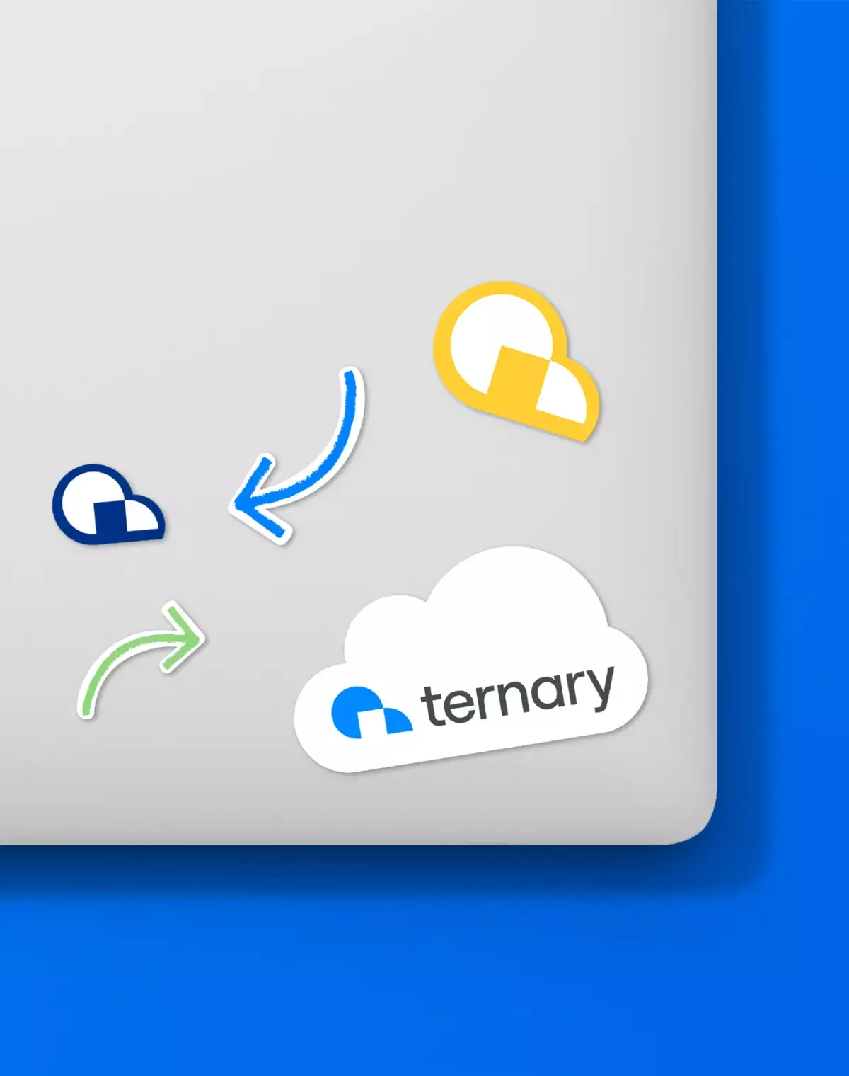
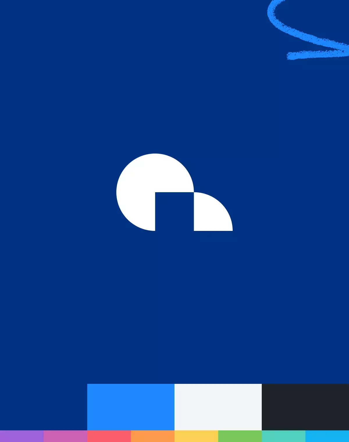
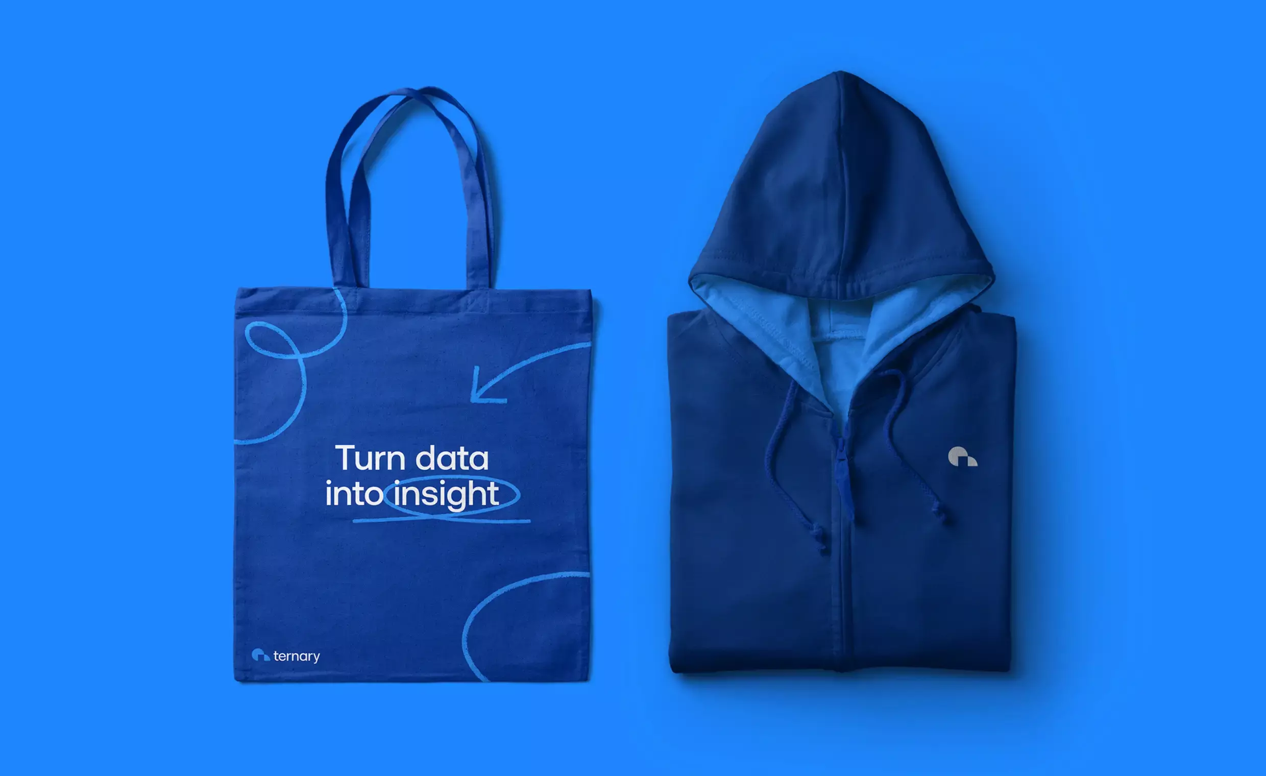
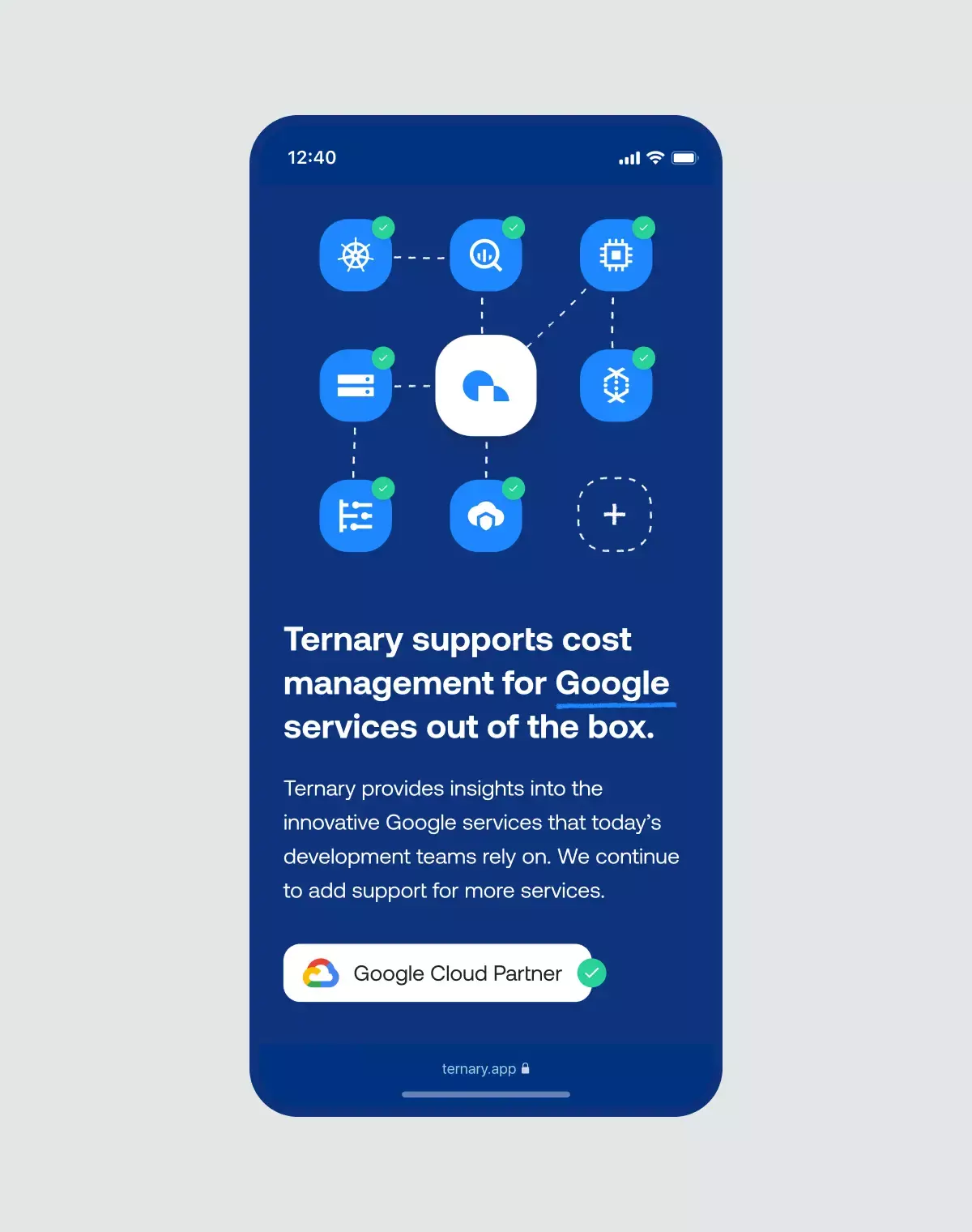
The logo symbol represents a simple cloud consisting of an opening pie chart. The unlocked cloud emphasizes both the industry and the services that the Ternary app offers.
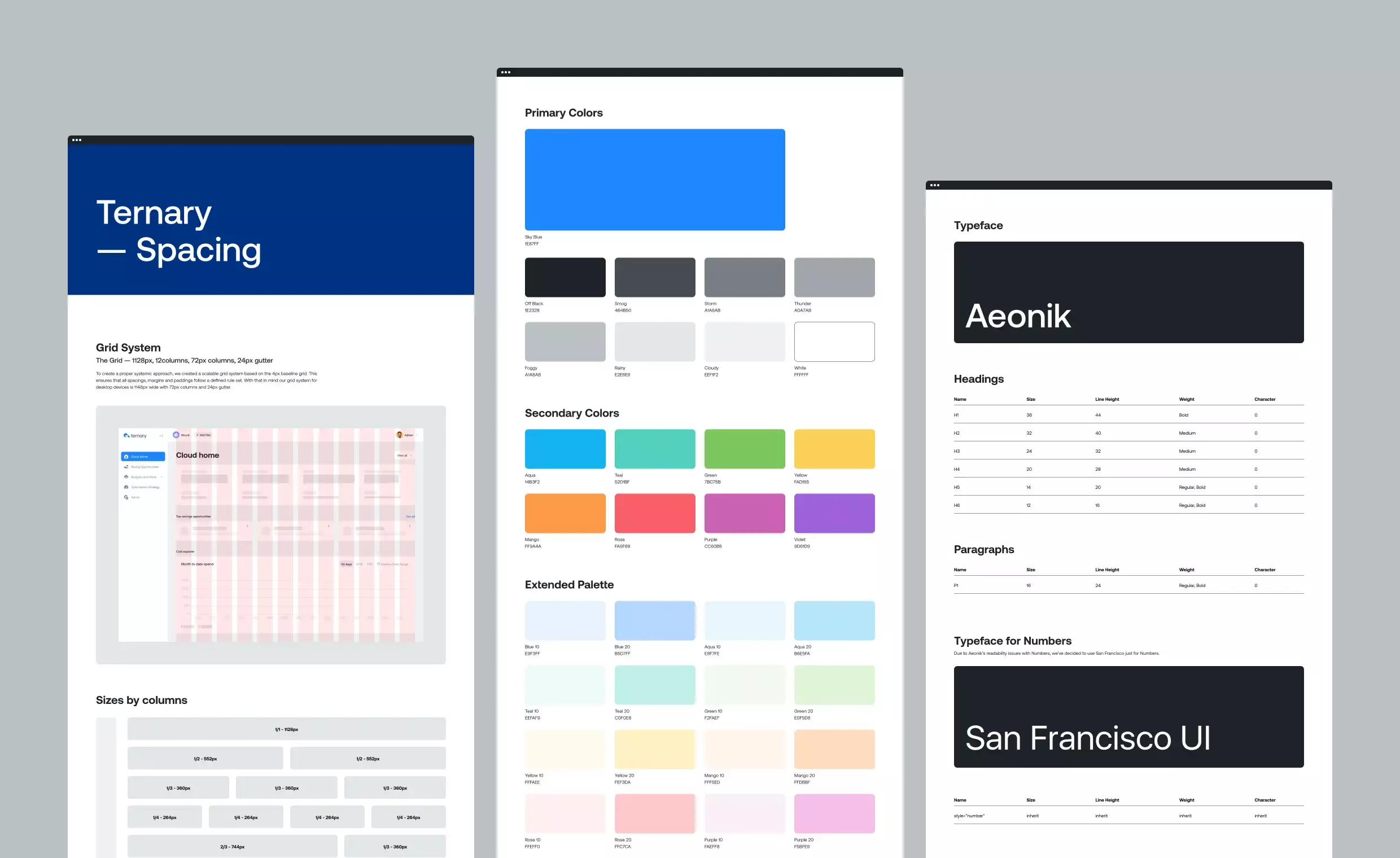
Our brand font is Aeonik by CoType Foundry. It features a tall x-height to improve readability and a geometric skeleton with rounded terminals that give our text a rational yet approachable character. While we were thrilled with the font choice for the letters, we reverted to the system font for the numbers to improve readability, using San Francisco on iOS and Roboto on Windows.
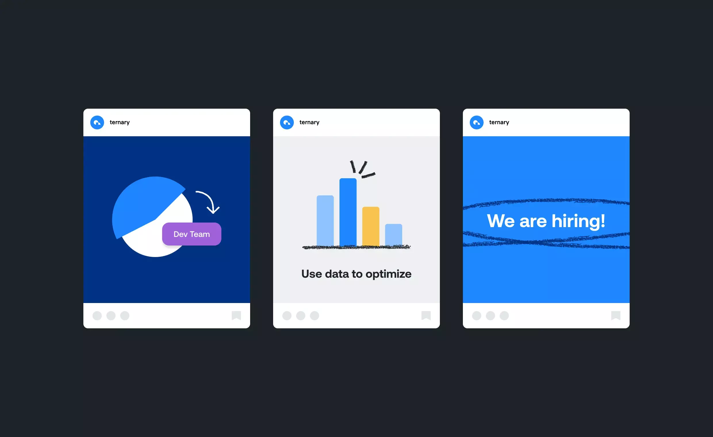
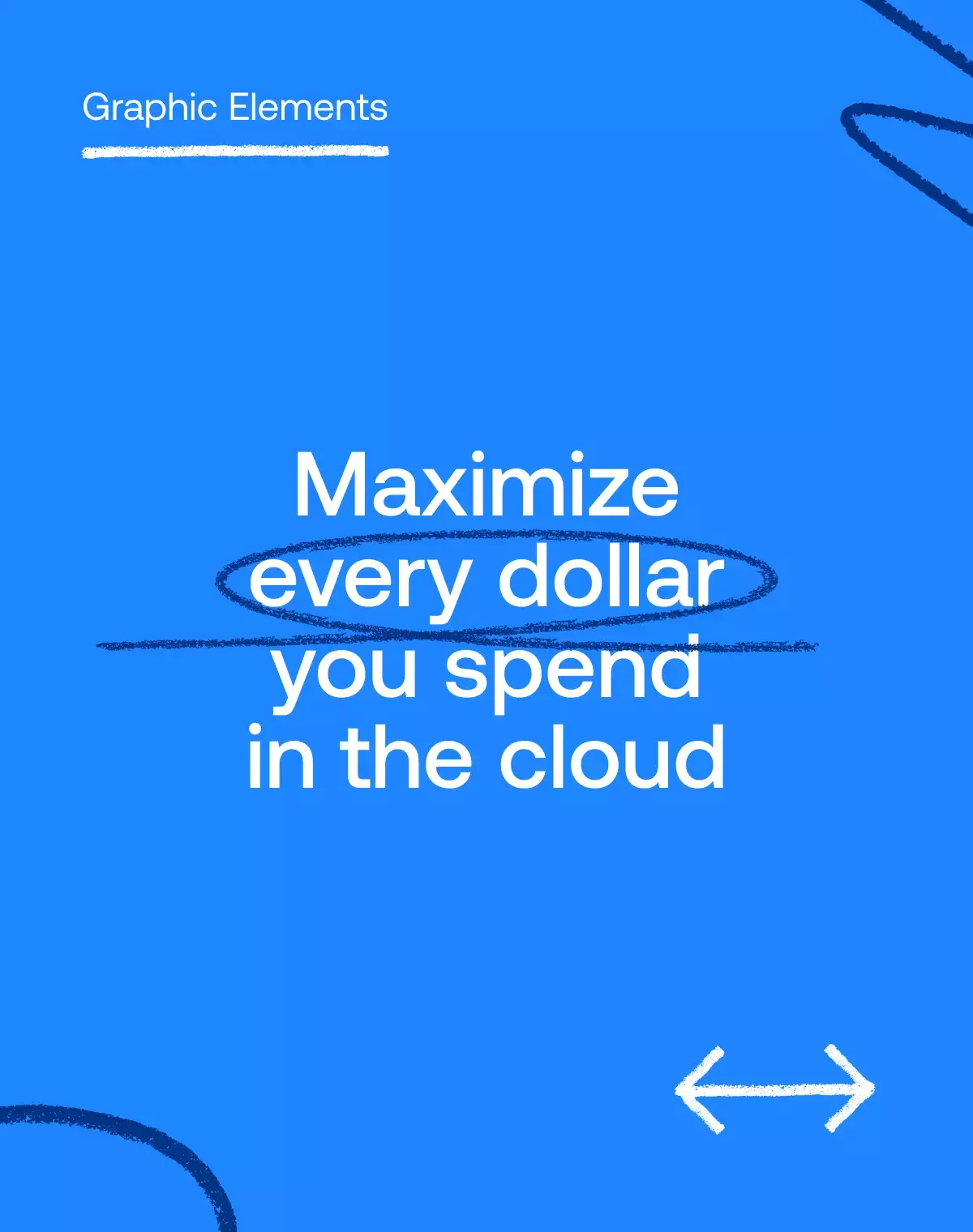
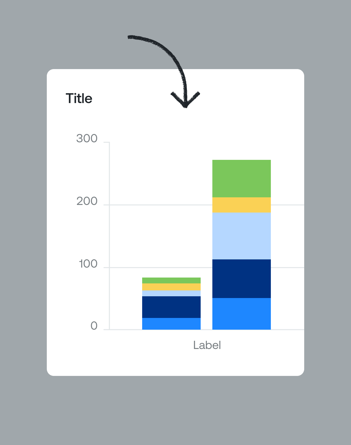
Since the product is chart-based, analytical, and precise, we thought it could use a bit of imperfect human touch. So we added a series of strokes, arrows, and scribbles to emphasize the most important aspects of our messages and images, and to balance logic with spontaneity.
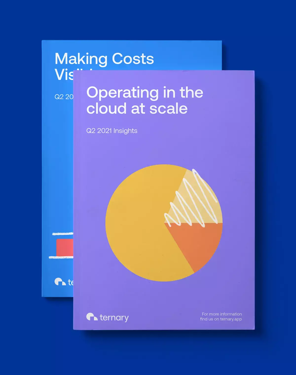
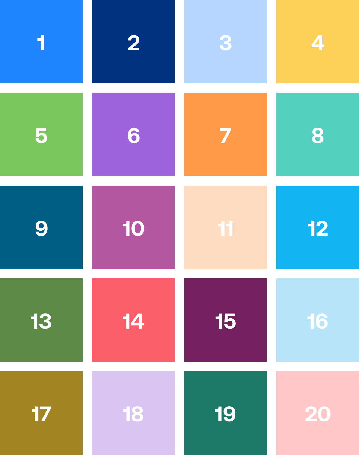
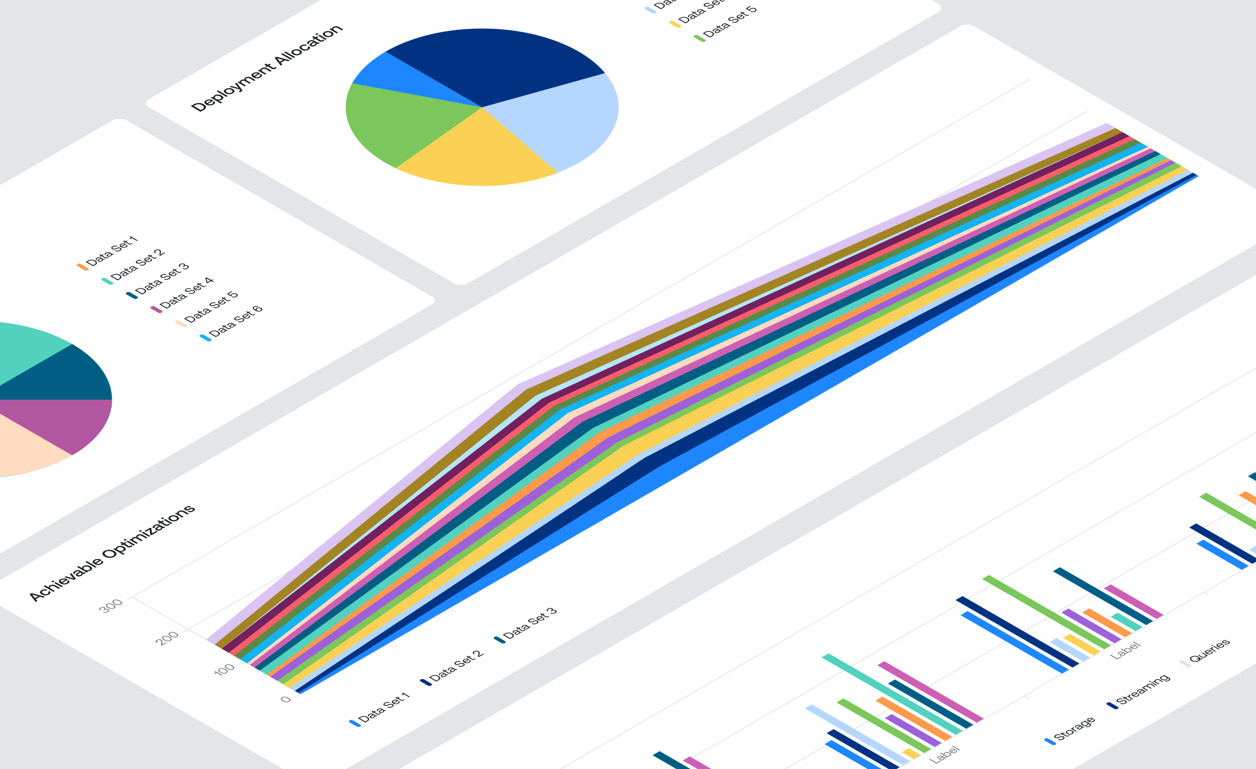
The color palette needed to be flexible and integrate multiple colors to meet data visualization needs. We developed a high-contrast system that uses over 20 colors for the charts in the hierarchy and can display up to 500 data points.
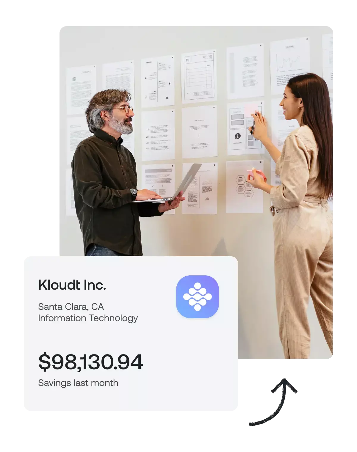
Update: After this redesign, Ternary raised $12M in a series A fundraiser led by Jump Capital.
Contact.
Email: hi@louislemoine.me
Dribbble: @louislemoine
© Louis Lemoine 2023
Brand & Product Designer